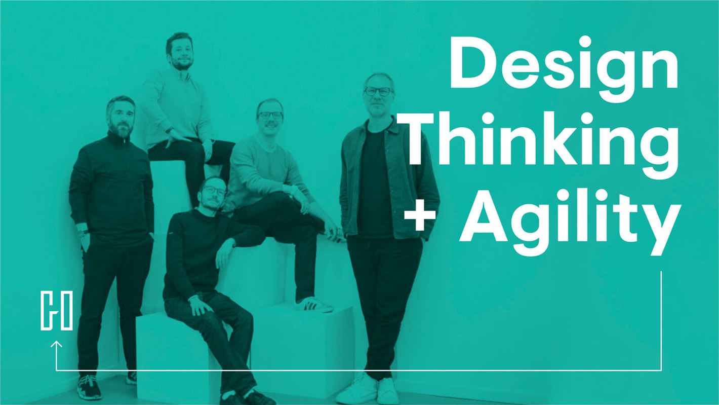
Haigo: Combining design thinking and agility

Haigo was welcomed into Sid Lee’s collective in January 2020. Co-founder and Managing Director Guewen Loussouarn spoke with us about how the company combines design thinking and agility to deal with its various clients’ issues.
First of all: what is design thinking and agility?
To describe it simply, design thinking helps us focus on the user, quick prototyping, and the combination of areas of expertise. As for agility, that allows us to go through very short cycles and focus on pragmatically delivering solutions without wasting resources. At Haigo, we’ve combined these two ideas on a daily basis for five years, and we teach these concepts to our clients and at schools like HEC Paris, 42, La Sorbonne, and London Business School.
What Haigo really does
We do many different things: websites, mobile apps, workspaces, processes, organizations, education programs… Across very diverse sectors like insurance, luxury, healthcare, and cryptocurrency. The common link between all of these is that way we work and our ultimate goal: we make tangible and useful products, quickly and with a smile. And because we’re curious, we try to take on different projects every time.
Collaborating with clients in their own office
When we first started, Haigo didn’t have an office. Teams set up at AXA, the offices 15 years of “traditional” agency experience, this was a revelation. We didn’t have to schedule meetings to talk – we could just ask a question in our open offices or hang our creations up on the walls. We also learned a lot about how this client worked and made decisions, which greatly improved our collaborative process as well as our effectiveness. That’s not to mention the relationships we created by the coffee machine, which can’t be beat.
This closeness became key to the way we work, with one limitation: on Thursdays, everyone went back to Haigo (meaning Sid Lee Paris’s offices, which also house the staff at Yard) to talk and share our experiences.
Even now, while everyone’s working remotely, we’re still in our clients’ Slack and Teams channels. We broke down these barriers by truly embedding ourselves into our clients’ teams, and everyone enjoys its.
A summary of the process
First, we find the right problem to solve by doing user research. We observe, we analyse data, we meet with lots of clients, prospects and partners; this allows us to really understand the user journey. We come out of it with a question like, “How can we help this target solve this problem?” It’s the basis for the design brief.
Then, we think of solutions with our designs and as many experts as possible across various fields. There are no imposed limits or deliverables. A website or an app isn’t always the right solution, because sometimes they’re too complicated to deploy or they’re not always so useful in a given context, so we identify the best solution to our problem.
After that, we make sure that these great ideas aren’t just left on Post-its. Between prototyping and creating the product, service or experience for the user, a lot can happen. So, we work with all the experts needed to create the solution progressively with periodic deliverables. We keep the big-picture view in mind, but this approach allows us to move forward every week with the certainty that we’re moving in the right direction since we test the solution regularly.
A concrete example: A brief from the Banque Publique d’Investissement
The Banque Publique d’Investissement in France (Bpifrance) wanted to help small-business owners integrate digital into their everyday operations in a better way. Our first intuition was to create a very involved content portal with a big budget, lots of planning, and many people to mobilize. User research taught us that the target audience had very little time to devote to training – maybe the length of a coffee break, during which they preferred reading the news on their phone. It also taught us that their needs were very pragmatic (“How do I sent my clients an email?”) and that they valued feedback from their peers more than content created by Parisians who were far removed from their situation. By working with local advisors and entrepreneurs, we designed and tested a very simple mobile app containing short two-minute lessons – a “digital coach” for the Banque Publique d’Investissement en France. Rather than developing it ourselves, we chose an off-the-shelf app that our client had actually invested in. For distribution, there wasn’t any big marketing campaign; local Bpifrance advisors took care of it. This was far from our initial intuition, but it was the right solution: closer to the field and much less expensive.