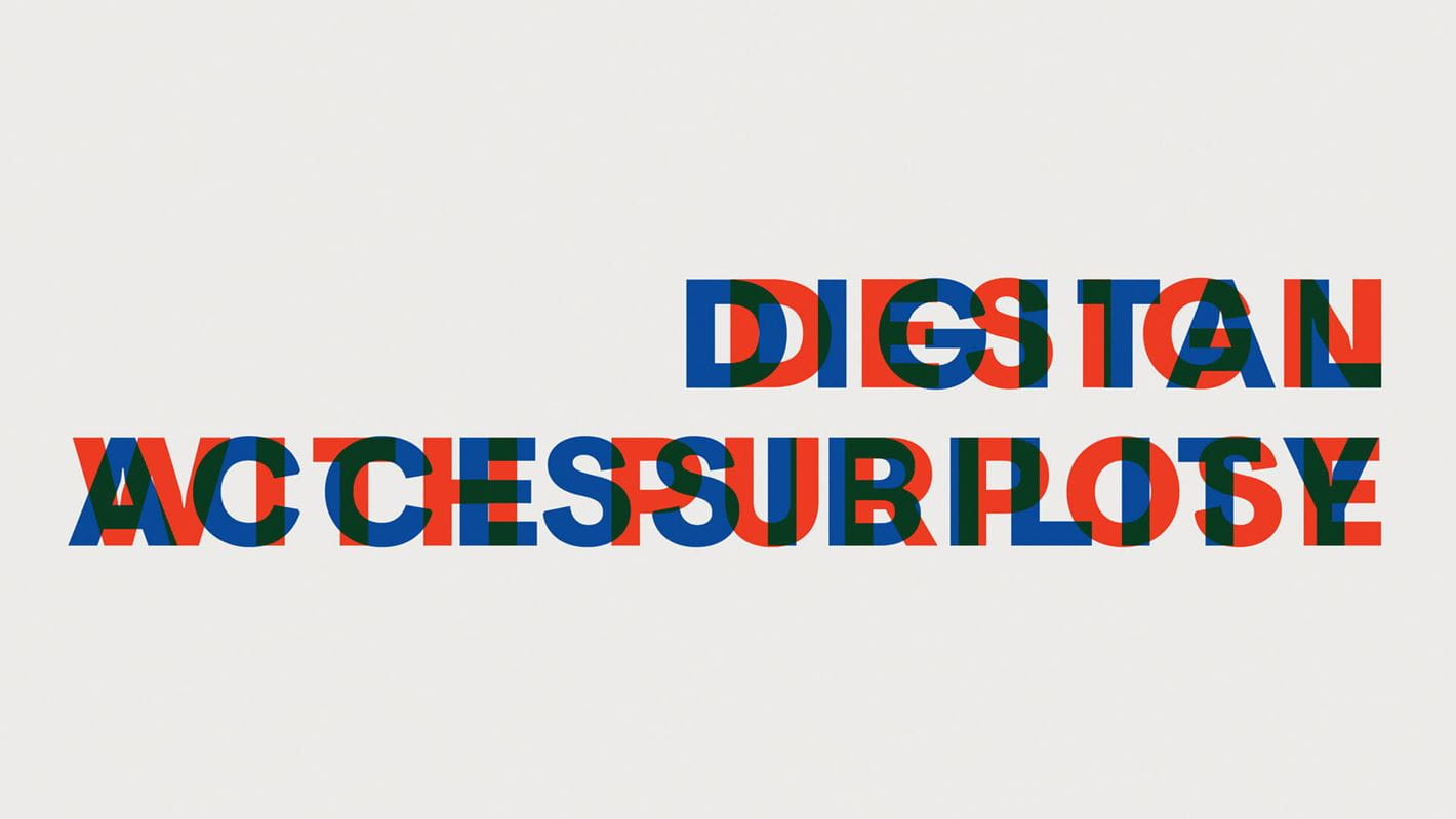
Digital accessibility: The human truth of inclusive design
Good design is both aesthetic and functional. By this definition, a well-designed website or app is one that is accessible to everyone.
Today, 26% of Americans and 22% of Canadians over the age of 15 have some sort of disability, be it a physical, cognitive, or neurological disability or an auditory or visual impairment. When websites and apps are accessible, everyone can use and explore them with the same level of ease. Yet digital barriers that non-disabled people may not be aware of still exist. Issues like low-contrast designs or vaguely worded links may be the difference between whether or not a person can access information, book an appointment, or even purchase a product.
People are now relying on the internet for their basic needs more than ever. It’s also worth noting that disabilities come in all shapes and sizes and may be temporary or situational, like breaking your glasses.
Below are insights garnered from three inclusive design advocates. Keith Bundy offers his perspective as a Digital Accessibility consultant who has 40 years of experience and also happens to be completely blind. He’s joined by our own Corina Boland, Senior Director of Growth & Innovation, and Jean-François Lavigne, CX/UX Strategy Director. Each offered their own insights on accessibility’s place in growth, innovation, and UX strategy.
What, exactly, is digital accessibility?
Put simply, digital accessibility is the practice by which digital products like websites and mobile apps are made accessible to people with disabilities. This includes inclusive design methods, discussed below, and the use of assistive technologies like Be My Eyes and Aria.
Here’s what we learned from Keith, Corina, and Jean-François about ensuring web design is accessible.
Start now
As the old adage goes, change comes from within.
Accessibility is a function of culture, not an IT concern. Corina advises companies to address their internal ideas, and, in turn, external messaging, to transform the brand instead of just applying tools and standards. After all, she notes, “the moral fibre of a brand is compromised when you don’t design with everyone in mind.”
Create consistent cues for navigation and orientation
Consistency ensures that users and assistive devices can flow smoothly from one page to another. To achieve this, navigation cues should be in the same format and location on every page. They should also use the same colours and phrasing (think sign in vs. log in).
Check your colour contrast
To meet legal accessibility requirements, webpages need a contrast of 4.5:1 or higher (Black and white, for example, has a contrast of 21:1). Otherwise, people with visual impairments may have difficulties distinguishing the text from the background. The higher the contrast, the more legible the screen.
Make links clearly identifiable
For efficiency, people using screen readers may opt to have their reader focus on the webpage’s links only. If links are nonspecific, like “click here” or “read more,” the user may not know where the links lead.
If links are clearly labelled with their location or even a short description, they’re accessible for everyone.
What about you?
If you’re uncertain as to your website’s accessibility, there are a variety of online tools that can help. SiteImprove, for example, is an online software that checks some of the parameters outlined above and provides actionable insights for creating a more inclusive website experience.
The world is rapidly becoming more conscious of ways we inadvertently marginalize people with disabilities from everyday life. Access to information is a human right; the time is now for brands to communicate and act on inclusive practices. “Disability,” notes Jean-François, “is a conflict between someone’s functional capability and the world we have constructed.”
When building a website, an app, or even a brand, let’s do it with everyone in mind.